"Which areas, events, or ideas does our attention revolve around or return to?"The Center is both a deceptively simple concept, and a fiendishly difficult one. When I was dwelling on the idea, though, I kept coming back to the psychological concept of "locus of control" - that is, where the control of a person is located within their psyche (either realistically or not). Children have an external locus of control; people often develop external loci of control in abusive or discriminatory situations, and an internal locus of control is central to developing as a psychologically healthy adult. The locus, the center, is where we return to time and again in our lives and in our art; it is what we might circle around like a planet in orbit around the sun, or what might draw us in again and again like the driving forces of arrows pointing to a single place. Some people revolve around other people, some people revolve around themselves, and some people revolve around some critical idea or object of their attention.
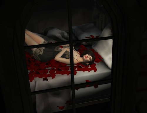
Would You Lay With Me by DanteAmore
DanteAmore's image above is one of the more literal forms of center - the black lines of the window and the black framing of the image, as well as the central placement of the color, pulls the eye back again and again to woman lying and dreaming on her bed. On another level, her position, the fact her eyes are closed, and even the title itself imply she is mentally revolving around some longed for object of affection. The singular focus of the image reflects the singular focus of the woman within the image, both messages working in concert to reinforce what DanteAmore is trying to communicate. In this way, the idea of center on a compositional level can reflect the idea of center in a psychological sense, especially with the use of black to limit so much of the view to interiority. This would be a profoundly different - and more intimate - image if it were taken from within the room; the use of the window as a distancing element reinforces that we are viewing form the literal and figurative outside the evidence of a person's obsession with another.
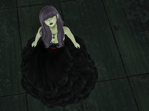
A to Z Challenge - E by Willow Llewellyn
The space in the image that Llewellyn's figure takes is similar to that of DanteAmore's figure, but in the above image we're invited into the building and the center is external rather than internal. Much of these two images is similar - the angle of the lines, the limited use of color, the spareness of the surrounding environment - but the emotional content is very different. In both cases the eyes return again and again to the face of the main subject of the image, but Llewellyn's image draws us in through her subject's gaze - we are being directly addressed from inside of the room, rather than observing an interior process from outside. Given so little other context, it's the subjects expression which must be interpreted for the emotional content of the image - direct, yes; challenging, perhaps. The center is clearly her and her relationship with the viewer, and that is where we return to again and again.
Carnival by Mafalda2 Diesel
I organized these mages in order of the complexity of their backgrounds and what gravitational force our center was working against, as well as the placement within the image. As the former grows more complex, the latter pulls evermore toward the center of the image. The three images above had a passing acquaintance with the Rule of Thirds, which adds a dynamism to them, while the image remained singular and the background remained (relatively) simple. The three images below have complicated backgrounds and the center around which those backgrounds revolve is much more complex. Diesel's image uses depth of field to give the impression of a bustling background, but the lack of focus and blow out of light on one side keeps it simpler than what one might think. That fuzziness sends our eye back again and again to the figure in the center, and her arm carries us up again and again to her disguised face. Once more there is visual engagement with the viewer, but in this case the central theme seems to be - appropriately - mystery, as her face is obscured, and once again the fuzziness adds to this theme by making the background equally as mysterious. This alignment of compositional and psychological focus reinforces the idea of center within each image.
Alirium by Roiben Sweetwater
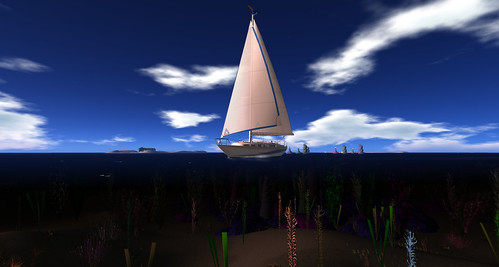
The final three images show a centered figure, with the main difference being how far in the background they've receded. In Sweetwater's image above the head of the subject herself is central while her body is not; the horizon line isn't quite even, but it's closer to the middle than one of the thirds. This makes things slightly off kilter - like the fall of Sweetwater's subject, but not quite. Compare this to Beaumont's image below, where the boat is dead center, as is the horizon line. The triangle of the sail draws our attention below; the sense of falling forward catches our attention above. Above is movement, below the absolute stillness of the sea with an astonishing view above and below the flat line of horizon. The central placement raises the prominence of the figures while, using the same dynamics as I explored in the post about balance, the offer up a sense of stasis and stillness.
What Lies Beneath by Wildstar Beaumont
The final image I chose, from Ember, has a really interesting composition where the straight lines are used to draw attention to the round platform they're on, and from there into the small figure in the middle of the image. I love the use of light in that image in particular - there are speckles of brightness elsewhere, but the main flush of brightness is right below the figure, pulling eyes through the shadow and mistiness right to where the subject plays her harp. Like above, the use of a triangle is used to set the central focus; unlike above, that triangle is significantly smaller, so it's important the larger, closer foreground draws the attention down and to the middle. There's even a very subtle spiral effect through the heights of the columns and the placement of the red plants - both of them circle around the central focus of the figure, reinforcing it's nature. It's really interesting how a central focus can change how the foreground and background is perceived, as well as how it can affect the emotional content of an image. Like the DanteAmore's image, the figure in Ember's image is disconnected from us both by distance and her own gaze, but like the first image she also holds our attention, only this time through the complexity of her surroundings, not their simplicity.
gold portraits, harp by darlingmonster ember


No comments:
Post a Comment