
"How do the qualities and relative importance of the constituent aspects counteract each other, both inside and outside the system?"
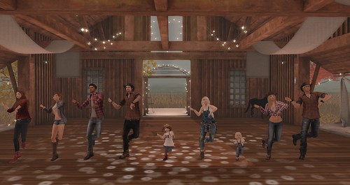
Dancing all up in a line by Nivaya Barbosa
Balance was deceptively simple to begin with. During my first run through my galleries, I was drawn to anything symmetrical or centered, the strong figure in the middle offering up the sort of perfect balance which standing on the fulcrum of a see saw offers. Barbosa uses this symmetry of the background, using the room as a static base for figures in motion - the figures themselves defying the symmetry, and offering a repetition form of balance physically - everyone is on the same beat. One of the issues with strict symmetry is stasis, though; in the pictures above and below, subtle tensions and a sense of movement in suspension offer diversions from the still of the overall image, while the locked nature of the overall image gives a sense of eternity in both. More specifically below, the stillness is the point entirely - the title "Lost in Thought" makes it clear this is a person drifting within her own moments of stillness. Even then, though, she places herself off-center and the telephone poles in the background aren't quite even, two aspects which keep it from being too frozen while maintaining the overall balance of the image.
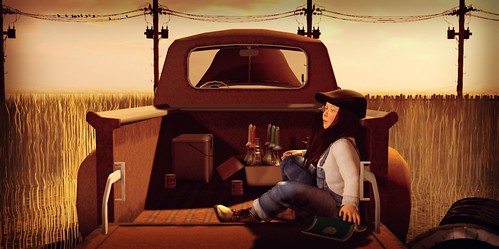
Lost in Thought by Marianne McCann
The triangle of the truck descending into the distance also gives a sense of depth which offers up another vector for finding balance within an image. In this sense the weight of the front of the truck - unseen but implied, - counters the relatively slight weight of the child and her supplies in the back. The other piece of balance I found above is more starkly laid out below - the balance of the height of the image with the large shapes within. The bed of the truck above (excluding the wheels) is the same as the height of the image itself. In Parkin's image below, the width of the telephone poles is the same as the height of the windmill - offering up an internal but cantwise balance that forms a subtle L shape within. Unlike McCann's image, where the horizontal shape is centered and thus more obviously balanced, the image below offers a different sort of balance that even in it's stillness doesn't offer up the same kind of static implications as the backdrops above.
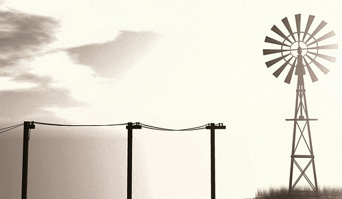
Landscape details 5 by Melusina Parkin
Zenfold offers up a more squared shape than the otherwise horizontal images that have dominated this exploration of balance, and that offers up a cantwise balanced figure and uses color to give the backdrop more weight, balancing out the lighter figure. This placement of figures at the extreme edges of otherwise simple, textured backgrounds seems to be Zenfold's style overall - an exploration of her photostream offers up a plethora of that same, seemingly unbalanced yet balanced images - the more overt tension making each one eyecatching. One thing to notice, though, is that when the backdrop is simple, the placement of the figure is extreme; when the backdrop becomes move complicated, the placement of the figure moves closer to the standard thirds placement that most artists use in their images. It's the very simplicity of the image overall which makes the extreme placement to one or the other side seem striking, rather than seeming like the figure is devalued. Among many other figures, one near an edge seems more unimportant; in an otherwise bare image, the placement of figures becomes singular and there are more options.The shallowness of the image - the wall is just a little ways behind the figure in question judging by the shadow - adds to this sense of extremity and edges.
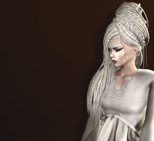
EMO-tions NEW: Nanina by Madeline Zenfold
In sharp contrast, Meili creates a sense of balance using extreme depth. In reality, the van would be much larger than the figure. In the image, it's smaller. Telephone poles are back as a visual element, this time at an angle to draw your eyes back and to reinforce the distance between figure and vehicle. The placement of both is also striking, in terms of balance. The vehicle is at the bottom third point of the image, coming into screen and bringing your eye up along the telephone lines to the taller figure, which is closer to the edge. A bit of grass hints at ground without actually showing it. The differences in size imply this should be an unbalanced image, but the depth adds a different sort of balance into the image, instead of along the horizontal line. Like the weight of the vehicle and triangular form offering balance in McCann's image, the slope and depth of Meili's image uses the implied weight of a vehicle with conventional placement to balance out a smaller figure in a more extreme position.
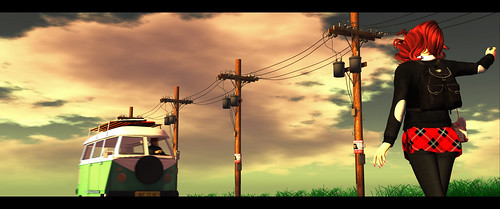
Open Roads ahead… by Lyndzay Meili
Extreme depth and multiple triangles dominate the final image that struck me as uniquely balanced - the one below by Diesel. Again, there are nods to more weight on one side with the helmet, but that slight weight is overpowered by the triangle of the throne and the triangle of Cleopatra within the triangle of Caesar's legs. This image has symmetry, but I'd argue the bulk of the balance work is in the depth of the image and the implied relationship of powers within the relationship between these two political and mythological archetypes.Again, the sense of balance implies stasis in this moment before either person acts, giving a sense of suspension and tension to the image which makes it incredibly powerful. Balance, I found, was no where near as simple as I had first assumed - nor as simple and static as it initially seemed.

Caesar, conquer my body by Mafalda2 Diesel
How do you express, explore, and use balance in your work?
Do you avoid it? Try to escape it? Or subvert it?
I prefer to frame things in thirds. In fine art the Rule of Thirds can be used to create a more interesting balance. In commercial art we try to control where the eye looks and how it travels through an ad. The Rule of Thirds helps.
ReplyDeleteI do a lot with the Rule of Thirds but I've been enjoying looking at what I think works in situations where that is less important than some other compositional themes.
DeleteThanks for stopping by!