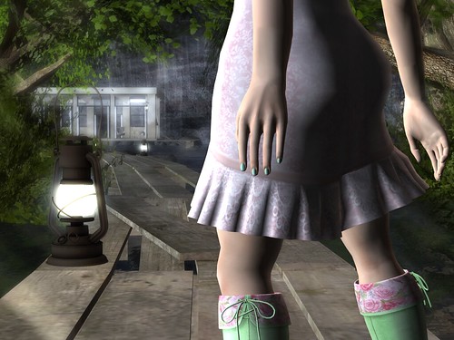
For a recent contest I decided to retake a picture I'd quite liked from the past, and I thought you all might like to see the changes that resulted from enhanced graphics and slightly different aesthetics. Some of the other details were changed as well - I'm using a new skin, though my skintone tends to remain fairly consistent; I am a pale girl. I chose a different, more dynamic hand for the second shot - looking at the simple curves I simply wanted more - and the advent of skin appliers for hands means that there isn't an obvious join between hand and arm. I had also upgraded to mesh wings since the first picture - the angle didn't work for flat image wings, but a dynamic, curving mesh wing worked beautifully. I'm on the fence about other dynamic changes - limiting the frame to just a house, for example, and not sowing as much of the background. While I managed almost the same angle, the framing is very different. I was trying for something more intimate and arresting, and I'm not sure whether I managed it. The biggest difference is the addition of shadows and the lighting choices - going for a cool, rather than neutral, palette.
I'd love peoples' opinions on the changes - what worked and what didn't. So often Second Life photography is thrown out into a vacuum of non-response or favorites without much nuance, and while I know I'm changing over time, I'm not sure if I'm improving as such.
Credits for Old Picture:
Skin: De la Soul, Aestali - Cream Rose
Credits for New Picture:
Skin: Izzie's, Irene
Wings: Deviance, Sidhe
Both:
Hands: SLink, Mesh Hands
Dress: Lassitude & Ennui, Naiad sundress
Boots: G Field, Long Cuff Boots "Will"
Pose: !bang, stand 223
Location: Hazardous
Water Settings: Glassy
Photographed by Deoridhe Quandry
Post processing: Cropping, only


No comments:
Post a Comment