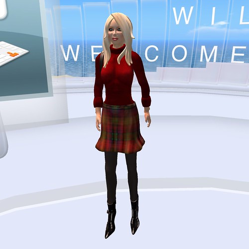
Through the website, I chose this look for Sainmhiniu - it turns out it's called the "Student" set of clothing. I'm not entirely in love with the boots, but I adore the little skirt and the cute backpack on my back. You rez in a white circle of welcomes in many languages.
A few quick, minor complaints - I rezzed with two skirts on, and had to take off the black skirt which was a secondary choice for this outfit; I'm guessing this might have had to do with Phoenix's ability to add extra things to one attachment point, but I could be wrong. Also, the shoes don't take care of the viewer two alpha layers, which is a real shame since my feet stuck out when I rezzed.
Also, contrary to the cute, smooth animations of my little person on the website, the default animations are still absolutely horrible. It's a very sharp contrast, and not an entirely welcome one. For people entirely new to Second Life, there is a way to get those smooth animations through wearing an Animation Overrider; check out Day Two for me getting one of them, or check out the Just Rezzed Gift List to leap ahead and find one on your own.
In general, though, when I rezzed in Second Life the first time, I felt very cute and sassy - ready to take on the grid! And right in front of me (and indeed all around me) was my first instruction on how to walk.
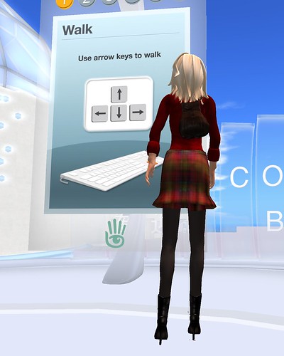
I particularly liked that these were set up all around you. As the most basic command, knowing how to walk by using your arrow keys really gets you going. The sign (indeed all the signs) were clear, easy to read, and attention grabbing. I could easily see them from a distance, and the inclusion of the numbered steps (once I figured out I couldn't click the sign for more instructions!) were useful to let me know I needed to use this new skill to find the next board.
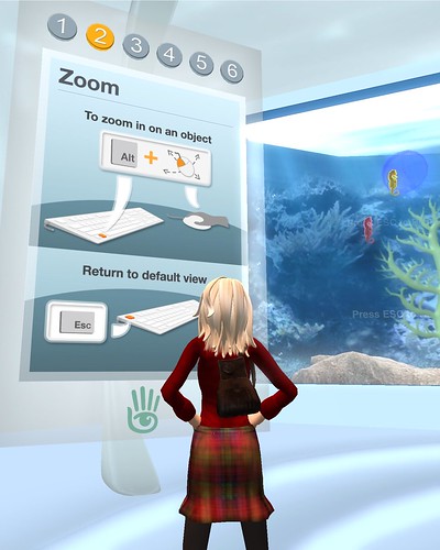
The second step was in the next room, and also introduced some color and movement to the surroundings, which was very welcome. I particularly liked that something interesting was placed next to instructions on how to zoom! Just alt-click on something and your attention instantly jumps over there. The additional instructions on using escape to leave zoom, which was repeated on the back wall of the fishtank where you were invited to look, was also an excellent idea.
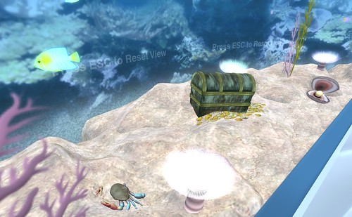
Above, you can see me practicing my new skill at zooming, with pictorial evidence. I have to admit, I spent a long while watching the little crab moved around, and watching the chest open and close. I guess I'm just a dork a heart.
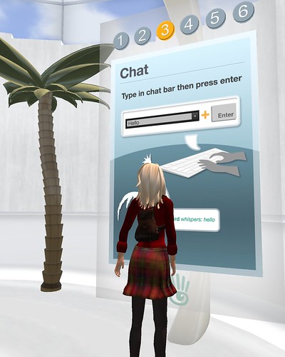
Now that we know how to walk, and we've practiced looking closer at things, the next tutorial is on how to talk. Just type into the chat bar, press enter, and suddenly you can chatter away! The visual representation of the steps, as well as what your words would look like if you spoke, really made this step clear and easy. I'm wondering if including some instructions on emoting using /me might have been a good idea, too, though.
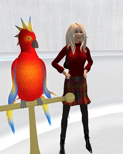
Besides the palm tree in the Learn To Chat room, there was also a very chatty bird who spoke to you when you entered, and invited you to ask him for a kiss. It seemed like a Kodak moment to me! I have to admit, conversations with those of the avian persuasion never held my attention, so it wasn't long until I was seeking out step four.
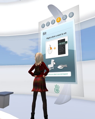
Step four is sitting, a simple task whereby you right click on something and select "sit". I had some confusion here, though, because although I could sit on some things, it seemed like they hadn't put good animations into the chair. Combined with the default sitting animation, and ...lets just say it looked weird.
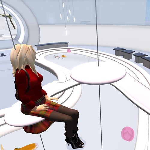
I ended up trying to sit on all kinds of things, including those floating balls in the water which caused effects if you clicked on them. There seemed to be a gap in the tutorial again, because nothing was said about touching things causing effects, and yet both the chairs and the balls had effects when touched - the chairs were "sit on click" designed, and the balls either lit up or caused one of the swimming fish to jump over them. Being able to cause things to happen by clicking on things seems like a fairly basic skill to teach, and one important in Second Life, but it's not included in the tutorial.
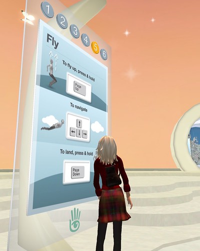
Step five is how to fly - probably one of my favorite abilities in Second Life. You fly by clicking "page up", move forward on a horizontal plane by using your arrow keys - just like walking! - and move on the vertical plane by using page up and page down. Again, this room is very well set up, with a fading gradient up the sides of the room and things floating in the air to make ones first flight interesting and enjoyable. It also gives a sense of the verisimilitude in Second Life; how it is at once realistic and cartoonish.
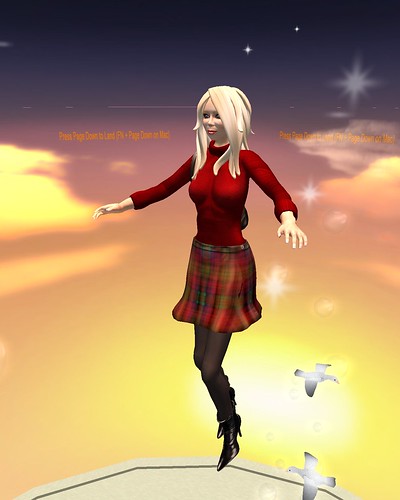
Once more, they included instructions on getting down in the air, moving gently, which is good for people who fly before reading the whole instruction!I spent a while floating, looking at the birds and starts, really enjoying the view, before I hit ground again and headed for the last step.
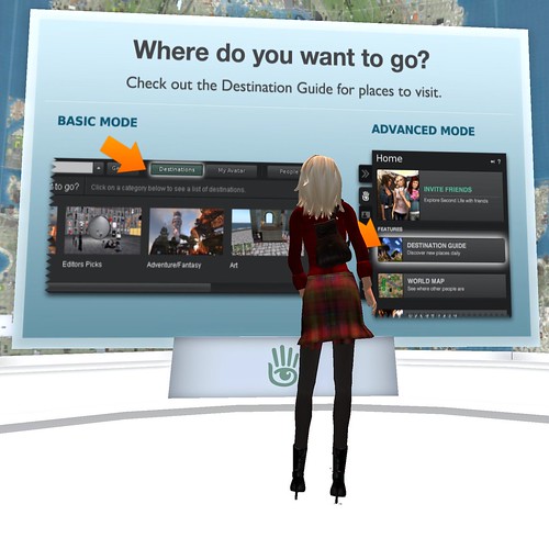
The decision to use the Second Life Destination Guide is ultimately a good one, I think, and this sign does a good job of showing that there is an Advanced Mode without being overwhelming for people who start in basic (which appears to be the default download, now).
My one critique is that most places in the Destination Guide are not set up to receive Day Zero newbies. Most don't have welcome areas aimed at that population, and many newbies are feeling lost or frustrated because they teleport somewhere and no one is there, they don't know what they're supposed to be doing, and it's not what they expected. I know a few people in the Destination Guide who are beginning to set up New Player Receiving Areas - but that places an undue burden on people who are paying for the dubious privilege of introducing new players to Second Life, using their own land and primcount.
One solution might be a "New Player Set" made by Second Life which doesn't count against the prims on a sim (or counts as one prim, like Linden Trees do). It could include notecards, links, information, etc... as well as a teleport to perhaps some kind of secondary tutorial with more advanced skills, like how to go into appearance mode, emote, open boxes, and such. Land Owners could also, perhaps, drop a notecard into it about their sim. If you made up the display to match the clean design of the welcome area for new players, it could foster a sense of continuity, introduce them to different types of areas, and remove some of the burden from land owners to provide the secondary tutorials which Second Life has so far not been following through on.
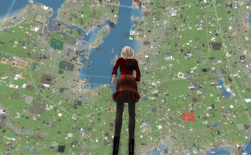
One thing I loved about this room, though, was the map of the mainland. It looks huge, and impressive, and very interesting; it reminded me of my early days on the grid, when everything seemed fresh and overwhelming. I don't actually spend much time exploring mainland, tending to teleport from place to place, but that may change with Sainmhiniu as I go through her first days as a Second Life Resident.
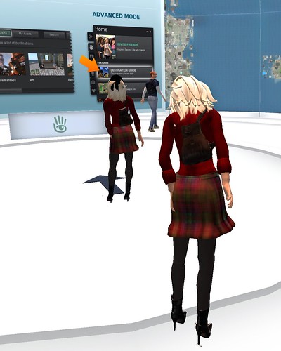
As I was in the final room, contemplating my options and trying to talk to the guy in the blue shirt, I was given inspiration for what I want to do on Day 1 - get my own look! So tune in for the next installment of Sainmhiniu Joins Second Life for an exploration of gifts for those who have just Rezzed on the Grid.

No comments:
Post a Comment