Showing posts with label Cila. Show all posts

Wednesday, November 11, 2015

Art Corner: Warrior in Wait

Warrior in Wait

This is a more artistic, singular take where I was trying to set a mood of stealthy watchfulness. The outfit started with the Cila armor style and got filled in with old standards, like my Rosal gloves and boots, and a new gift from Stockholm & Lima that a friend gave me. The final touch was a fairly severe updo from Wasabi Pills to fit the martial sense with it's orangey-pink highlights. I started with a fairly stark windlight, to capture the shadows being cast across the layers of leaves and my clothes and played around with the east angle and time of day until I got a sharp angle across everything - angles generate interest and keep the eye moving throughout the image. I tried to narrow everything down as far as I could - aiming for texture in the backdrop instead of any individual items, and struggled for some time with what I wanted in the background - the angles didn't work well to get the path or watermill in the background, but an errant hit on the side instead of back view gave me this fantastic angle slightly off to one side. I always struggle with cutting out the face, but in this case I felt like the Grafica pose offered a sense of the person waiting even if her face was out of view.

Once set and take, I opened the image in Gimp and cropped it down to it's present size. The bamboo down the center had a line of highlights along it which was very distracting, though, cutting the image in half and causing my eye to get "caught" on it repeatedly. Using colors I picked up from the background, I strengthened the cross cuts of the shadows across it and it receded into the background instead of messing up my composition. I had already set my figure off center; the other piece was to have int he background a sense of something she could be looking at without being too specific. Composition somewhat rescued, I brightened the image slightly and amped up the contrast to make everything more vivid and visible. The final touch was using "oilify" for the brush-like effect. On the strength I liked for the background the forefigure became uncomfortably indistinct and softened around the edges, so I made a cut out of the figure alone, erased around her edges, and then used a much lower "oilify" level. The overlay was effectively flawless, as the choppier style of the leaves made blending the two layers a breeze.

I'm really happy with the use of diagonals, but I'm not entirely pleased with my composition - though I'm not sure how I would want to improve it. In thumbnail it's a striking combination of lights and darks. I'm wondering if the pink being only along one side is an asset, as it makes it stand out, or a deficit, as it makes it really different from the mottled green backdrop. I really like the angle and cropping, though; I think it conveys the sense of anticipation and watchfulness well, and
is dark without being indistinct.I'm wondering if I might want to use less contrast in world if I anticipate editing my image in Gimp.

Friday, September 25, 2015

Dancing Steps

Feather Wind

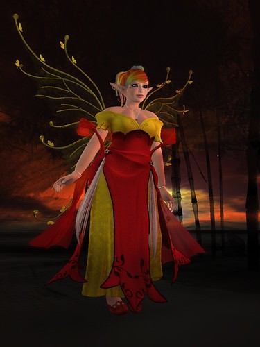
I had a ball with Cila's outfit from the Fantasy Gacha Carnival - and I love her gacha style; her rares are color based, and by and large the colors all work together pretty well. I've been running into more gacha like this, a little closer to the original idea of being inexpensive, fun items one didn't need to collect all of in order to enjoy the few one got. I ended up rounding out my collection a little with some purchases and even picked up a rare! Ah, the temptation to try to catch them all~

In Movement

China is a glorious watercolor sim which can be tinted every which way, and there is nothing quite like a rainbow sunset exploding in every direction. The sim is an ink impression of bamboo, clouds, birds, and a single building. A few items are thrown in - a chair, a television - but it's easy to focus on the simple lines of an ink painting reproduced in three dimensions; you walk here among stylized China, slipping between the lines both literally and figuratively.

Momentarily

Tuesday, January 13, 2015

Dream a Little Dream

Sunbathing

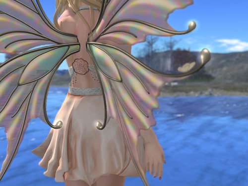
Oneword's "Dream" end on the fifteenth, disappearing like mist at awakening along with all of it's lovely items. I came to this event late - having gotten severely behind on my events! - but I'm very glad I took a few moments to pick up some of the evocative offerings. My dress, for example, is from Moon Amore and is a simple, lovely wrap dress with texture changing in the top and bottom. There are two packs to pick up - one light and the other dark - and each have variations on the deep cut bodice and high, flyaway skirt. I was drawn to the peaches and cream combination and really enjoyed the ruffled texturing of the skirt, which is lined inside as well. The skirt retexture does include the bits of cream below the waist, which makes mixing and matching the tops and bottoms a touch more complicated. My favorite effect on the whole dress was the back texture, though - a delicate wickerwork spiral and hanging beads on each side - reminiscent of an Ojibwe Dream Catcher without replicating it. My other Dreamy accessory is my eyeshadow - a lovely cream offered up by Wicked Peach in a set of several dual colored options. The colors are clear and bright without being overpowering, a wonderful complement to the delight of dreams.

Star Catchers

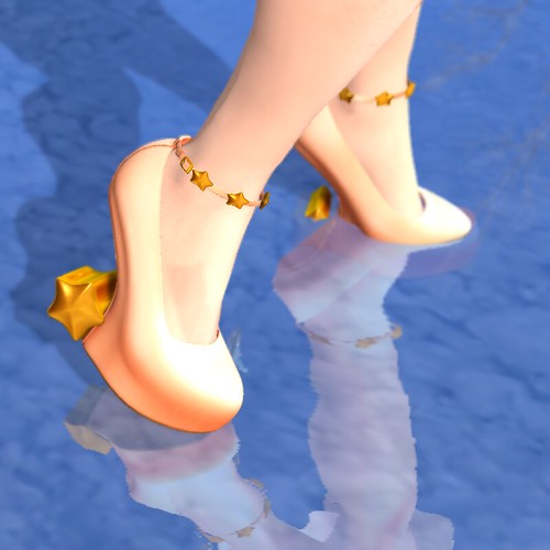
I rounded out my outfit with some lovely accessories, varying the intensity of the colors while trying to remain within a similar hue. My silvery snow crown from Bliensen + MaiTai calls up the cream of the bodice and my wings, a frosty counterpoint to the warmer oranges I'll add. I love the shape of it as well - arching up above the head with delicate snowflakes floating around each angled, sharp piece. My jewelry, a release from Maxi Gossamer at the Uber event, draws from the warmer edge of my iced peach outfit, a bright orange and softer, gold-edged peach set in silver - the silver a callback to all of the white I'm wearing as well. The heavy squares and circles also stand in contrast to the feather-light flow of my dress and the sharp triangles of my crown; I'm a fan of high contrasts in color and shape. While the colors of my jewelry might seem too bright in isolation, I echo them in my lovely Cila shoes set with stars. The shoe part is still a pale peach, but the star is gold incarnate and bright enough to balance out my bright jewelry. I love the anklet of stars connected to it as well, and the smooth transition from shoe to platform that makes the effect work. I finished my whole look with a casual, breezy updo from Ploom with loosely gathered loops of hair up in pigtails. The updo quality, with it's curving bangs, whispers of elegance even while the waves of hair over my shoulders laugh casually.

Dreamland

Monday, November 3, 2014

A Spot of Blue

The Fantasy Gacha Carnival opens on November 4th (in just a few hours!) and remains open until the end of the month. Sadly, long before that The Trace will close on the fifth, so head by to enjoy it while we still have it.

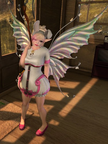
Image Description: Woman in a pink bloomer outfit standing in a wooden building.

The outfit I'm wearing from Cila will be released there - and almost everything I'm wearing is a common, which should entice those of you who normally avoid clothing gacha due to the difficulty in getting needed pieces to complete the look. The rares are the red corset piece (not shown) and the staff with the enormous blue stone. You can also mix and match between the colors, as they're in complementary shades of red and pink, and use the same decoration pieces. I kept to one shade for the full effect, though! It can be worn with and without the jacket, offering up varying levels of the theme, which is layers of scale skilfully rendered and colored. If you approach them from the side, you can see it isn't just a texture pattern, but rather looks like layers of cut and sewn fabric have been layered over each other. It's also all fitmesh, which led to interesting effects with my stomach in particular - Deoridhe's mesh form has a belly, which is extremely rare in Second Life, and enough saddlebags to smooth out the line from hip to waist. In the past, this has led to a problem with fitmesh because the mesh ends up rippling unattractively around those areas. With this mesh, however, I really liked the effect of a bowling out forward, and it made the bloomer sides look cute under the curve of the corset.

Image Description: Arms outstretched, woman stands in front of some fall trees, holding a staff in her right hand.

Recently, a few people expressed a desire to hear bloggers talk more about our styling choices and reasons for combining things as we did - and I thought I'd make a few notes here, since this is a very simple look. I wanted to center and highlight Cila's outfit, which is unusual and cute, and I used all of the pieces which didn't overlap, choosing a single color so that I could keep my shading mostly monochromatic with the single drama point of the blue ball in the staff. The high neckline of the jacket discouraged jewelry, and I decided to leave it off altogether. I wanted a cute hairstyle to complement the look where the hair would have bits of the same pink as the outfit, and I settled on Ploom's recent release, which comes with adorable headbands. Hair color was easy - the pink matched perfectly - and the only thing I struggled with there was how to tint the ears; as you can see I settled on the dominant shade of the look, white.

Image Description: Woman holding a staff and standing upright in front of a hill with trees turning read on it.

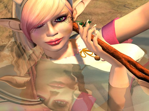
The cosmetics and nail polish was where I spent the most time - both in trying to match the slightly cool, matte pink and in the question of whether I wanted a second (or third) spot of bright blue. I ended up settling on a matte pink eyeliner from cheLLE (closed) - one of my go-to eyeliners because of the brightness of the color and the solidity of the shade - and layered two lipsticks, a matte shade from Damned to set the tone, and a gloss from Mock to finish it off. Ironically, the final effect is to make them vanish all but entirely except in closeup; in this case I wanted that, though for other looks or when I'm highlighting the cosmetics the focus will shift. Finally, I picked through nails I hadn't tried yet for something that had the right warm pink-white I wanted, trying on a bunch of different shades of pink and white until finally selecting a pearlescent shade from Frogstar. Like the cosmetics on my face, the ultimate goal for this look was to have the nails fade into the background in concert with the outfit, and I think this shade - a gold edged nailbed with a white french manicure - accomplished that well.

Image Description: Closeup of a woman mostly submerged in water looking into the camera.

There's a part of me that always feels bad when I select a creator's work in order to fade into the background, harmonized with the main theme of the look I'm trying to make. That is part of making a look instead of just combining disparate elements, though - some must play a supporting role to the others, or it's chaos.

Thursday, August 21, 2014

Fit for a Princess: Lacquer and Gilt

Stepping Back into the Sun

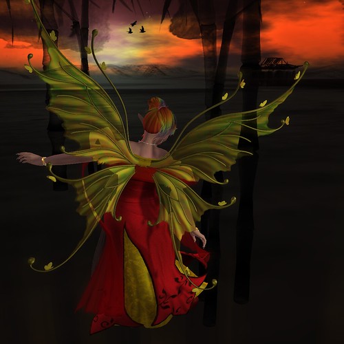
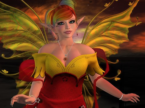
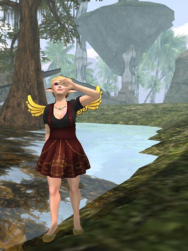
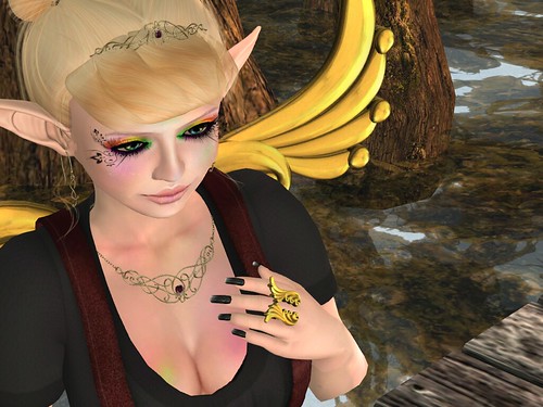
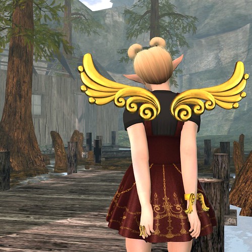
We're heading toward the end of the month and the wrapping up of Fit for a Princess, the romance edition, and I managed to make an entire outfit out of things available at the event. For instance, I'm wearing the cutest mini dress ever, from Nomi, with gorgeous detailing in the shape of elegant chandeliers and dangling chains. It's designed as overall style bands over either a white or black top, and rides the line between casual and elegant beautifully. The skirt and top look like different pieces but aren't, and sadly they're no modify, so you won't be able to tint your white shirt interesting shades of puce. The edges are extremely well done, however, with no jaggedness or oddness around the edges, and it's fully lined. It's also very well rigged and moves well in a variety of poses, even in the always difficult shoulder area. I also really liked the fit round the neck and over the bust - it's plunging without being indecorous, and necklaces layer well under it. It comes with a HUD which allows you to change the shirt color and skirt color - two colors for the top and four for the bottom. I love the growing trend of bundling colors under a HUD, even if it makes my sorting them more complicated. My largest accessories are all from Cila; the wings, bracelet, and ring all echo the same design and are pleasantly chunky. I really love the layered curves and curls which are reminiscent of wood carvings painted in gilt. They are a gacha prize, with gold as the rare set, and the other options are all pale pastels in red, green, orange, blue, and white - all lovely and tinted as if a soft lacquer was layered over them, ending up heavier in the cracks.

Light on my Feet

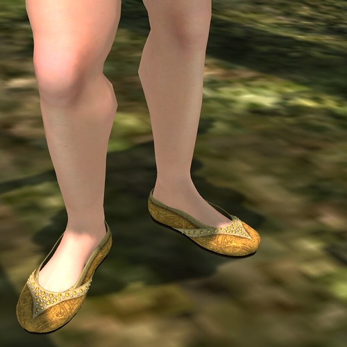
I paired the heavier Cila jewelry with a more delicate necklace, tiara, and earrings set from Cae. The design is curving metal woven in and out of each other in a lovely manner, with a single gem set in the larger pieces. Again, there is a fantastic HUD included; two sets of metals and a vast plethora of stone colors. The curve of the metal is the best part - smooth with delicately curling ends. I also love the idea of two sets of metals to mix and match for greater effect, though I chose a solid gold in this case. I echoed the gold in my delicate slippers, made for the SLink flat feet by Dysfunctional Designs. They are a simple round toe base with delicate metalwork over the top and down the sides. I ended up looking really closely, and those delicate balls sewn into the shoe? They actually are three dimensional. The texture of the rest of the shoe is equally well done, complicated enough to fade into interesting lights and darks from a distance, and simply lovely up close. Finally my nails, from an old favorite A:S:S, provide a variety of fleur de lis in a variety of colors, all of them simply perfect. Using just shades of a single color, A:S:S uses different shades to make the fleur de lis stand out and seem like it's shining of of each unrealistically elongated nail. Absolutely a class act.

Calm in the Bayou

The only part of my look, in the end, that doesn't come from the hallowed halls of August's Fit for a Princess is my Adore & Abhor hair, which was a Hair Faire release and is now available in their main store. It's a lovely, slick updo with the cutest hairbuns ever, and I completely fell in love. My favorite touch has to be along the back of the neck, though - always a challenging part of the head. In this Adore & Abhor hair, though, it is a perfect curve under my skull. It is also made up of a number of shapes, which means that if your head is not the same as the creator that you can resize things to cover the necessary ground. It also fits beautifully behind my ears, which is always a bonus with updos and pulled back hair. If you're looking for something cute and perky, this hairstyle is one to try the demo of.

Awe and Glory