Wednesday, November 11, 2015
Art Corner: Warrior in Wait
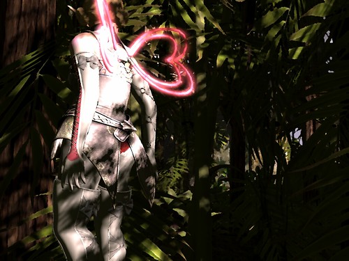
This is a more artistic, singular take where I was trying to set a mood of stealthy watchfulness. The outfit started with the Cila armor style and got filled in with old standards, like my Rosal gloves and boots, and a new gift from Stockholm & Lima that a friend gave me. The final touch was a fairly severe updo from Wasabi Pills to fit the martial sense with it's orangey-pink highlights. I started with a fairly stark windlight, to capture the shadows being cast across the layers of leaves and my clothes and played around with the east angle and time of day until I got a sharp angle across everything - angles generate interest and keep the eye moving throughout the image. I tried to narrow everything down as far as I could - aiming for texture in the backdrop instead of any individual items, and struggled for some time with what I wanted in the background - the angles didn't work well to get the path or watermill in the background, but an errant hit on the side instead of back view gave me this fantastic angle slightly off to one side. I always struggle with cutting out the face, but in this case I felt like the Grafica pose offered a sense of the person waiting even if her face was out of view.
Once set and take, I opened the image in Gimp and cropped it down to it's present size. The bamboo down the center had a line of highlights along it which was very distracting, though, cutting the image in half and causing my eye to get "caught" on it repeatedly. Using colors I picked up from the background, I strengthened the cross cuts of the shadows across it and it receded into the background instead of messing up my composition. I had already set my figure off center; the other piece was to have int he background a sense of something she could be looking at without being too specific. Composition somewhat rescued, I brightened the image slightly and amped up the contrast to make everything more vivid and visible. The final touch was using "oilify" for the brush-like effect. On the strength I liked for the background the forefigure became uncomfortably indistinct and softened around the edges, so I made a cut out of the figure alone, erased around her edges, and then used a much lower "oilify" level. The overlay was effectively flawless, as the choppier style of the leaves made blending the two layers a breeze.
I'm really happy with the use of diagonals, but I'm not entirely pleased with my composition - though I'm not sure how I would want to improve it. In thumbnail it's a striking combination of lights and darks. I'm wondering if the pink being only along one side is an asset, as it makes it stand out, or a deficit, as it makes it really different from the mottled green backdrop. I really like the angle and cropping, though; I think it conveys the sense of anticipation and watchfulness well, and
is dark without being indistinct.I'm wondering if I might want to use less contrast in world if I anticipate editing my image in Gimp.
Credits:
Skin: Izzie's, Irene
Hair: Wasabi Pills, Sorbet
Eyes: .:Soul:., Roomee
Eyelashes 1: SLink, Mesh Lashes
Eyelashes 2: Flugeln Brise, 05-A
Lipstick: .:Soul:., Fades
Ears: .:Soul:., High Elf
Wings: Stockholm&Lima, Neon Heart Wings (TAG Gacha)
Gloves & Boots: Rosal, Unmei
Outfit: Cila, Shara Elf of Luna
Tights: Stellar, In Bloom
Poses: Grafica, katana ii mirror
Location: Realm of Ozryn
Photographed by Deoridhe Quandry
Post processing: Cropping
Labels:
art,
Cila,
Grafica,
Rosal,
Second Life,
Stockholm & Lima,
Wasabi Pills
Subscribe to:
Post Comments (Atom)


No comments:
Post a Comment